Showing posts with label guru digital arts. Show all posts
Showing posts with label guru digital arts. Show all posts
Tuesday, August 17, 2010
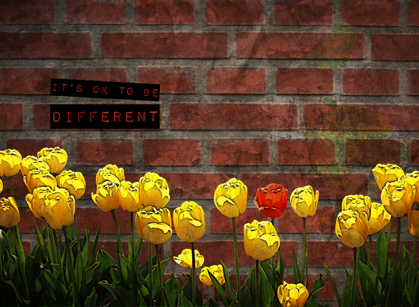
It's ok to be reusable
So I have been struggling through the weeds on a book layout project at school. The project was really just to do the layout for a promotional brochure for Guru Digital Arts College, but I decided to get all artsy and make some content. Anyway, although in real dollars I think this job might have paid me about 3 bucks an hour, it was worthwhile in other respects. Chief among these is that I gave many of the images different layer comps and tried to create them with reusable elements. The one shown below makes a fine postcard after only a few small modifications. 


Friday, August 13, 2010
Courage

Here's an image from a brochure that I am working on, which is becoming the project that ate my life.
Monday, July 12, 2010

Tuesday, June 15, 2010
Photoshop is squishy

I swear, I love photoshop a bit more every day. I also love the people who think up incredibly cool and creative things to do with it, even though sometimes I have no idea who to credit. This image is the result of an exercise we did in Danielle's class at Guru Digital Arts, which is based on a tutorial from somebody who knows a thing or two about manipulating graphics creatively. I think the idea of building a bug from spare parts is just brilliant. My final image is more elaborate, but here you can really see the many creative possibilities for constructing an image this way.
I can't wait to make a whole swarm of critters from spare photo parts.
Monday, June 7, 2010
Creativity... I has it

Ok, after a weekend of experimentation in combining illustrator and photoshop, which produced nothing that I am willing to show... (yet anyway), we did this wee but worthwhile exercise in class today. Assignment: draw from a deck of um... sort of like tarot cards, and illustrate or express the card in 1 short hour. The card I drew was The Earthy, and this is the image I came up with.
It's pretty good for an hour's time especially considering the time spent looking for and installing photoshop brushes, browsing textures, masking out the Courbet nude etc. It was an exercise meant to jolt our creative juices into flowing, and I think quite successful all round. I am considering doing one a day as an exercise in creative discipline, but maybe I'll give myself 2 hours next time.
Credits: nude from Courbet's Nude Woman with Dog. Trees, ferns and dandelions were photoshop brush freebies from BrushKing & Brusheezy. Background textures were both freebies from Bittbox. Owen and Beth for the assignment :)
Friday, June 4, 2010
Shattered... finished
How's that for a dramatic title? Just teasing -- really this post has nothing to do with being shattered. And as it turns out, I'm not actually finished the piece. But I thought that I would add a blog post to show what ended up below the header tidbit that I posted earlier. The project was an interface design for Chris Caldwell's class at Guru Digital Arts. Shattered Clothing is a (mostly) T shirt seller of wearable limited edition designs made by an inmate on San Quentin's death row. Their original website was not so good, so our job was a redesign.
Anyway, mission mostly accomplished on my part. Caldwell's main criticism was that I had not taken the grungy theme as far as I might have and that specifically the little web style buttons looked out of place and would have been better as paint smears. I was actually worried that I had gone too far with the grunge and that the thing wouldn't look like a business web site at all. But as soon as he mentioned the buttons, I knew he was dead right.

Anyway, mission mostly accomplished on my part. Caldwell's main criticism was that I had not taken the grungy theme as far as I might have and that specifically the little web style buttons looked out of place and would have been better as paint smears. I was actually worried that I had gone too far with the grunge and that the thing wouldn't look like a business web site at all. But as soon as he mentioned the buttons, I knew he was dead right.

Tuesday, June 1, 2010
Today's tidbit
Thinking about web sites and their elements has pretty much taken over my Guru life. From site maps and wireframes to icon sets and general interface design, it's all web this week and last. Today I made a start on an interface that has to be finished tomorrow. This is just the header so far, but it's off to a promising start.


Monday, May 24, 2010
How to be an iconoclast
Ok today's primary assignment is a poster for #yeghelp in the style of David Carson. In case you don't know who that is, David Carson is a typographic designer of rather large repute. Some call him the father of grunge. Most everyone would call him an iconoclast. He basically walked into the neat and tidy world of typography as a rank and unschooled amateur and ripped it apart. Then he smooshed and squished all the ripped up bits together. His designs look kinda like layers of posters weathered by rain and glue.
Arguably Carson's best known quote, and one which very much sums up his approach to typographic design is, "Don't mistake legibility for communication.".

When I first went to art school, (before David Carson climbed off the surf board and started rocking the typographic world) legibility was pretty much king of the hill. There were some notable exceptions -- groovy pyschedelic posters from the 60s, the odd spot where decoration wasn't an embarrassment, things intended for very specific audiences making wider accessibility less of an issue. But basically if we hadn't tightly held to the guiding principle of legibility first and foremost, our teachers came down on us hard. They used scalpels and glue sticks to mend our errant ways. It was for our own good, they said. Legibilty was important they thundered, nagged and whined, because communication was what typography was all about. If people couldn't read the words, you had failed in your mission to communicate.
But see, this is what makes David Carson a genius. Carson knows that communication is what typography is all about. He just thinks that simple legibility leaves out much of what communication is all about. Without anyone ever telling him otherwise, he figured out that visual communication happens prior to reading. Visual communication is there in shape and colors and textual feel, and we receive that message before we start reading. So he roasted the sacred cow of legibility. My favorite Carson moment, and a truly heroic act, is him deciding to set what he took to be a "poorly written and insipid" article on Bryan Ferry all in dingbats. It's too perfect. It's a stroke of genius.
Now the notion of emulating an iconoclast is a strange one. In this case plan B might be to veer sharply back and strive for perfect legibility using clean black and white Helvetica with mathematically perfect leading and optimal kerning. But the iconoclast thang happens to be only my spin on the situation -- really the assignment is to emulate Carson. As difficult to execute as plan B is, plan A of sticking to the assignment might actually be harder. Trying to paint like Jackson Pollack looks like it's gonna be easy until you actually try it. So I better shut up and get started.
At any rate, #yeghelp and Carson are a good thematic match. Twitter is kind of a chaos of layered and jumbled words, big on communication, but not necessarily so big on content. So I think I'll stick to plan A as assigned and settle for sending my tweets in dingbats as my own little plan B.
Arguably Carson's best known quote, and one which very much sums up his approach to typographic design is, "Don't mistake legibility for communication.".

When I first went to art school, (before David Carson climbed off the surf board and started rocking the typographic world) legibility was pretty much king of the hill. There were some notable exceptions -- groovy pyschedelic posters from the 60s, the odd spot where decoration wasn't an embarrassment, things intended for very specific audiences making wider accessibility less of an issue. But basically if we hadn't tightly held to the guiding principle of legibility first and foremost, our teachers came down on us hard. They used scalpels and glue sticks to mend our errant ways. It was for our own good, they said. Legibilty was important they thundered, nagged and whined, because communication was what typography was all about. If people couldn't read the words, you had failed in your mission to communicate.
But see, this is what makes David Carson a genius. Carson knows that communication is what typography is all about. He just thinks that simple legibility leaves out much of what communication is all about. Without anyone ever telling him otherwise, he figured out that visual communication happens prior to reading. Visual communication is there in shape and colors and textual feel, and we receive that message before we start reading. So he roasted the sacred cow of legibility. My favorite Carson moment, and a truly heroic act, is him deciding to set what he took to be a "poorly written and insipid" article on Bryan Ferry all in dingbats. It's too perfect. It's a stroke of genius.
Now the notion of emulating an iconoclast is a strange one. In this case plan B might be to veer sharply back and strive for perfect legibility using clean black and white Helvetica with mathematically perfect leading and optimal kerning. But the iconoclast thang happens to be only my spin on the situation -- really the assignment is to emulate Carson. As difficult to execute as plan B is, plan A of sticking to the assignment might actually be harder. Trying to paint like Jackson Pollack looks like it's gonna be easy until you actually try it. So I better shut up and get started.
At any rate, #yeghelp and Carson are a good thematic match. Twitter is kind of a chaos of layered and jumbled words, big on communication, but not necessarily so big on content. So I think I'll stick to plan A as assigned and settle for sending my tweets in dingbats as my own little plan B.
Subscribe to:
Posts (Atom)

 Posts
Posts

