Wednesday, September 22, 2010
Finals
Ok, so even though I am making lots of pictures, it's final exam and final portfolio time and I am a little disorganized. I promise, Dear Blog, that I will faithfully post again starting soon. Please, if you run into Flickr, give her this message as well.
Sunday, September 5, 2010
i know, i know...

There are probably lots of things that I could be blogging about, since there are certainly lots of things on my mind lately. But I just have so much going on, down, sideways and probably pear shaped in the next couple weeks, that I am only posting a postcard for now.
cheers
Wednesday, August 18, 2010
imagination
In the interest of keeping up with my output, another image from the Guru booklet. enough said.


Tuesday, August 17, 2010
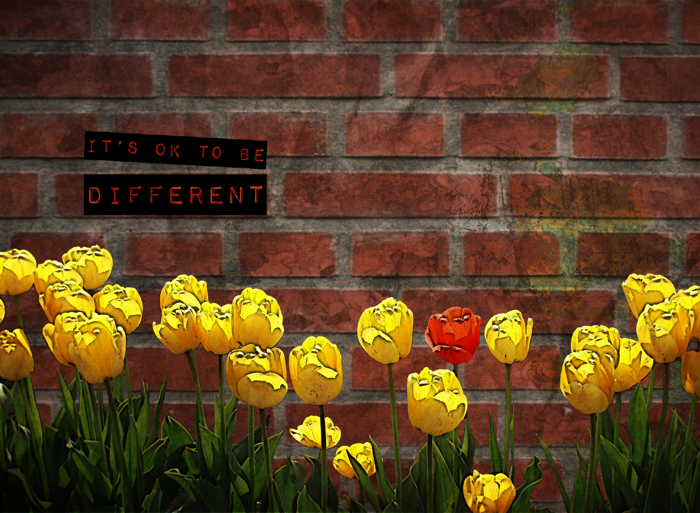
It's ok to be reusable
So I have been struggling through the weeds on a book layout project at school. The project was really just to do the layout for a promotional brochure for Guru Digital Arts College, but I decided to get all artsy and make some content. Anyway, although in real dollars I think this job might have paid me about 3 bucks an hour, it was worthwhile in other respects. Chief among these is that I gave many of the images different layer comps and tried to create them with reusable elements. The one shown below makes a fine postcard after only a few small modifications. 
Friday, August 13, 2010
Courage

Here's an image from a brochure that I am working on, which is becoming the project that ate my life.
Monday, August 2, 2010
Sunday, August 1, 2010
Neglected
So my blog (yes, this one) sent me an email to say that she was feeling neglected because I haven't posted anything for awhile. So I made her a picture, which I hope will convey how I feel about blogging becoming yet another chore on my to do list. Hopefully this will be enough to soothe her for now.
sheesh

sheesh

Saturday, July 24, 2010
Branding
HUGE assignment this weekend. I need to totally rebrand a tea company. they need a business focus, we're going high end, a personality, we will be classy and luxurious, a logo, a web site, packaging design, and an email HTML flyer.
I'm looking forward to the project, but I have almsot none of it pulled together yet.
I will post any bits as they are created.
CHARGE!
I'm looking forward to the project, but I have almsot none of it pulled together yet.
I will post any bits as they are created.
CHARGE!
Monday, July 19, 2010
Frustration
I am fed up with the nonsummer weather, tired of waiting for the funds to purchase my Empire Avenue upgrade (so that I can sell more shares of myself) and thoroughly sick of having to drop projects that I am only half-way into so that I can start work on the next looming damn thing.
there
there
Saturday, July 17, 2010
Yay today
I made scones in the early morning, worked on packaging design for the rest of it. In the afternoon I strolled through a huge outdoor art exhibit, came home for beers and a BBQ with corn and potato salad. I made vegetarian chili for tomorrow and sold out my shares on Empire Avenue. (yahoo) I beat hubbie at poker, but let him win crib, since there is already a growing list of games he won't play with me. And now? Now I plan to develop my taste for skunk weed and single malt scotch, both of which I am sure I can learn to like if I just apply myself.
Thursday, July 15, 2010
Embedding experiments
Well, since my own animation attempts are so far under feeble (so far), I decided I should get some web design work done. I need to be able to play video on a site I am working on, and I debating how to go about it.
One way is an embedded link, and I hope this works for here because it's a beautiful little piece by Simon Rouby.
One way is an embedded link, and I hope this works for here because it's a beautiful little piece by Simon Rouby.
Le Présage (the Omen) from Simon Rouby on Vimeo.
Tuesday, July 13, 2010
No pictures today
Alas, I spent most of the day trying and failing to overcome my Flash blockage or impairment or whatever my problem is whenever I am confronted with a new program to learn.
I swear some people just start dancing across keyboards finding short cuts and testing whistles and ringing bells. I spend a week grumbling about the fact that nothing ever seems to come with a manual anymore. Then I spend two weeks looking for the missing manual online and reading tutorials. Then I have to practise in dead of night, well actually crack of dawn more usually. And eventually I make something amazing.
Today was not that day. It wasn't even one of the practise in secret days. Maybe tomorrow will be that day and then soon I'll have the amazing day.
Monday, July 12, 2010

Saturday, July 10, 2010
Midterms

Phew, midterms are over. Quite an unusual experience really - exams in visual arts. Yesterday's was the most fun and also the most productive for me. The assignment was to design a satirical poster on the BP oil spill while also emulating a graphic designer of our choosing. I ended up with 3 pretty good roughs, the best of which is shown above.
Thursday, July 8, 2010
Beautiful photos
Found some beautiful stuff on Flickr by a Mr. Graves. His landscapes have the kind of personality a portrait might. And his portraits have the vastness and poignancy off great landscapes. If you like Ansel Adams, or Tarkovsky films, you will like these.
Wednesday, July 7, 2010
Epic fail...

Well I can't say that we weren't warned that we would be set up for an "epic fail". We just weren't sure when it would happen or what form it would take. Turns out it came in the form of a Mission Impossible Midterm.
I'm left trying to decide whether it would be better to analyse the errors of the day in hopes of never repeating them, or whether I should just blot the whole thing from my mind.
The accompanying image is admittedly a pretty bad treatment, but it was made in its entirety in under 10 minutes, which unfortunately seems to be what is meant by workflow.
heavy sigh
Tuesday, July 6, 2010
Vectors, vexels and vexations

First off vector images are great in a number of ways, but their real advantage from a designer or artist's point of view is their scalability. You can make them reeeeally really big or really small with no loss of clarity whatsoever. You won't be able to test that here, because once I have posted an image to the web, it becomes a raster image, meaning it's made up of a bunch of little pixels. Everything you see online is a raster image no matter what program it was created in, no matter what file format it was saved in. Got that? That was vexation number one.
Vectors only really have an advantage in print media. If you think about a logo for instance that might get printed on everything from a business card to a box car then you will be able to appreciate the importance of scalability and why logos are almost always vector images. But this wasn't about logos or print even. These were for things supposedly meant for the web. So not being able to achieve the effect that I wanted for some small online icons with vectors, or in this case in Illustrator in general, I got in a snit about the whole "must be vector" regime that I was dealing with at the time.
I got over it more or less, but then there was the whole separate issue of the vexel, which is different than a vector image. A vexel is a sort of bastardization of vector based images and pixel based images. They start out in Photoshop, a program that I love dearly despite its inability to create real vectors. What I think happened was that people who had Photoshop, but lacked Illustrator learned to use the former's ability to make vectorish shape layers as a means to achieve an almost vector image. Sorry for the jargon, if you're not a user of these things yourself.
Bizarrely enough however, what they chose to do with these almost vector images was to trace photographs which had first been manipulated in Photoshop. The manipulations are aimed specifically at achieving clearly defined areas of subtle color changes, which can then be traced using the pen tool and filled in with solid colors to mimic a vector shape. Many such shapes on many layers make a picture called a vexel. If you have ever seen a paint by numbers kit, then you'll have some idea what I am talking about. The plan goes something like this. Find a very detailed high resolution image and blur it in Photoshop, then posterize it into bands of color, then apply a blur layer to restore its original colors. Then faithfully, slavishly trace each and every one of the shapes you can see on a separate layer and viola, you get an image that is virtually indistinguishable from its posterized form. The main difference is that getting there in Photoshop doing nothing other than applying filters and adjustments takes 3-5 minutes, and getting from there to the finished traced version is likely to take 3-5 days. See the added aesthetic value? I don't.
In case the above isn't quite masochistically tedious enough, people doing this in Photoshop are forced to use the pen tool, since it is the only way to freehand a psuedo vector shape layer. Now the pen tool has a lot going for it if you need straight lines or bezier curves. But last time I had a good long look at a portrait or a landscape, both of these were in short supply. The world of natural things is kinda lumpy and rough around the edges. So the pen tool, which is touchy and time consuming is not the tool you want unless you need a perfectly smooth curve or a perfectly straight line.
Lucky for us, we did not have to do our completed vexel in Photoshop, we got to move over to Illustrator, which specializes in vector images and so has lots and lots of tools for tracing and drawing, all of which will produce vector shapes by default. Alas most people still stuck slavishly to the pen tool, because the instructions said to. Make that that 3-5 days above into 3-5 weeks and you'll get an idea of how many student hours went into making these things.
If you search the word vexel you will find lots, as well as tutorials if you have time on your hands and want to make your own. Most are much more photo-realistic than mine above. And my friend Dano has made a couple of gorgeous ones, one of which you can see here.
Actually, once I finally got off my ass and started one, I came to see the number of hours required as part of their charm. It is a lot like doing needlepoint, which I confess I used to find sort of addictive. If you combine vexel tracing with a decent podcast or two, you can pretty much do this until the cows come home, and if you're like me and don't have any cows, you can pretty much do this forever. Plus, when you're finally finished the damn thing, you don't need to sew it into a pillow. You can print it on the side of a box car and watch its perfectly sharp lines and flat colors fade off into the distance.
Monday, July 5, 2010
I'm baaaaaack
Sorry, sometimes you step away from something for a minute, and then you get distracted, and then you forget to come back, and well, you know how it is... next there's a leave of absence, then you meet some guy and move to another city, then there's a whole new career. No wait, that was before, this time I just went out to get some air.
I feel especially concerned for the Empire Avenue shareholders who lost money on me over the last couple weeks, (at least the ones not mercenary or sharp enough to sell me), so I will be doing what I can to rebuild my social capital.
Another reason for my quietness of late is the lack images to post. The last couple weeks have been all about learning to code web sites, and while it might be fun to learn to make a rollover effect for a button or a horizontal navigation bar, trust me, it's nothing you haven't seen before.
But I have been busy drawing, and I am sure I can drag something up here to post.
Tuesday, June 15, 2010
Photoshop is squishy

I swear, I love photoshop a bit more every day. I also love the people who think up incredibly cool and creative things to do with it, even though sometimes I have no idea who to credit. This image is the result of an exercise we did in Danielle's class at Guru Digital Arts, which is based on a tutorial from somebody who knows a thing or two about manipulating graphics creatively. I think the idea of building a bug from spare parts is just brilliant. My final image is more elaborate, but here you can really see the many creative possibilities for constructing an image this way.
I can't wait to make a whole swarm of critters from spare photo parts.
Monday, June 14, 2010
Saturday, June 12, 2010
Domain Name Despair Syndrome
What's in a name?
To move from one cliche to another, anyone doubting the adage that there is no such thing as an original idea need only spend an hour or so searching for a domain name. If that doesn't do it, then the next 10 hrs spread over the course of a week's worth of pondering great names surely will. Leaping out of bed to try just one or two, maybe seven more variations on your 38th from the top of your favorites list to find that they too are all already gone, ought to convince you that if it's not true that there is no such thing as an original idea, it is most definitely true that there is no such thing as an original Domain Name idea. Go ahead and try this for yourself: you name it - it's gone.
I have been obsessed with trying to find a decent and available domain name incorporating the word or part of the word pixel. So far, I have failed. Seriously, I must have been dreaming to think that such a thing was possible. I have since fantasized about calling up the peeps who already own the ones that I wanted and offering them, um, well I'm not sure what I could offer them. A few extra bucks and the promise to do a better job with both the name and also the site design probably wouldn't suffice.
Pixelbump is gone; so is pixelthat, pixelthis, pixelit, pixelpeople, pixelpeeple, pixello, pixomatic, pixelala, pixelgaga, pixelfit, pixelpleasegodjustthisone and COUNTLESS others. Don't even get me started on pixelpump and its derivatives, or pixelanimals, pixelcolors and pixelnumbers. Gone, gone, gone and get serious. Who are all these other people who think just like me? What hope is there of distinguishing myself and my work from the ocean of others already out there if the simple first step of an original name is beyond me?
The only hopeful sign is that apparently my experience is hardly unusual. Since starting this quest a few weeks ago, I have found several people who have also suffered from what I am calling Domain Name Despair Syndrome. What makes it a syndrome is that it's accompanied by a particular neurosis, or at least this is true in my case. You see one of the names that I wanted, a name that was in my top 5 choices IS still avaialable as a dot com. It's a great name. It not only was one of my original choices, it was first in line after pixelbump. It suits me perfectly, probably better than pixelbump does, is an original derivative of the word pixel and is also a word that expresses what I take to be an important design ideal. And incredibly, it's not taken -- not owned yet. It was available a week ago, and it's still out there waiting for anyone who wants it. And I do!! Or um, at least I thought I did.
This is where our despair gets its syndrome status from the simple addition of a bit of neurosis. Here's the thing. No one but me has thought to register this domain name, which is great because that means that I can have it all to myself. But it also means that no one else wants this name. That would still be ok, indeed it should still be fine and dandy - perhaps even an indicator of personal originality! if not for the lingering effects of all the fruitless searching of unavailable names. What I think happens is that so many domain name searches return unavailable as a result that unavailability itself starts to take on the allure of a desirable characteristic. I not only want what I cannot have, I want it because I cannot have it. The more unavailable it is, for instance if both the dot com and dot net domains are gone, then the more attractive that name becomes.
Worst of all, the name that I wanted, which is available has somehow become less attractive because it is still available. Now that, is clearly evidence that I am nuts. Bear in mind that this name was my second choice when the whole process started. But after hundreds of searches just trying to see what's out there, finding that it isn't makes it less attractive. It no longer feels like my second choice. Instead it feels very much like the name that nobody else wanted. So a week later when I log onto goDaddy and see that it is still available, rather than jumping for joy or at least feeling relief, all I feel is doubt.
Monday, June 7, 2010
Creativity... I has it

Ok, after a weekend of experimentation in combining illustrator and photoshop, which produced nothing that I am willing to show... (yet anyway), we did this wee but worthwhile exercise in class today. Assignment: draw from a deck of um... sort of like tarot cards, and illustrate or express the card in 1 short hour. The card I drew was The Earthy, and this is the image I came up with.
It's pretty good for an hour's time especially considering the time spent looking for and installing photoshop brushes, browsing textures, masking out the Courbet nude etc. It was an exercise meant to jolt our creative juices into flowing, and I think quite successful all round. I am considering doing one a day as an exercise in creative discipline, but maybe I'll give myself 2 hours next time.
Credits: nude from Courbet's Nude Woman with Dog. Trees, ferns and dandelions were photoshop brush freebies from BrushKing & Brusheezy. Background textures were both freebies from Bittbox. Owen and Beth for the assignment :)
Friday, June 4, 2010
Shattered... finished
How's that for a dramatic title? Just teasing -- really this post has nothing to do with being shattered. And as it turns out, I'm not actually finished the piece. But I thought that I would add a blog post to show what ended up below the header tidbit that I posted earlier. The project was an interface design for Chris Caldwell's class at Guru Digital Arts. Shattered Clothing is a (mostly) T shirt seller of wearable limited edition designs made by an inmate on San Quentin's death row. Their original website was not so good, so our job was a redesign.
Anyway, mission mostly accomplished on my part. Caldwell's main criticism was that I had not taken the grungy theme as far as I might have and that specifically the little web style buttons looked out of place and would have been better as paint smears. I was actually worried that I had gone too far with the grunge and that the thing wouldn't look like a business web site at all. But as soon as he mentioned the buttons, I knew he was dead right.

Anyway, mission mostly accomplished on my part. Caldwell's main criticism was that I had not taken the grungy theme as far as I might have and that specifically the little web style buttons looked out of place and would have been better as paint smears. I was actually worried that I had gone too far with the grunge and that the thing wouldn't look like a business web site at all. But as soon as he mentioned the buttons, I knew he was dead right.

Tuesday, June 1, 2010
Today's tidbit
Thinking about web sites and their elements has pretty much taken over my Guru life. From site maps and wireframes to icon sets and general interface design, it's all web this week and last. Today I made a start on an interface that has to be finished tomorrow. This is just the header so far, but it's off to a promising start.


Monday, May 31, 2010
Testing
This is just a test. If it were a real post I would go on for several paragraphs and use a better design as my visual. But this is just a test and the logo sample was just a tutorial. I now return to my irregular schedule.
Saturday, May 29, 2010
Vectors - tut, tut, tut

This weekend I need to learn how to get a textured pebble effect in illustrator. The ones you see here are from an icon set that I'm making (Guru homework). But these ones were made in photoshop, and the assignment is an icon set in illustrator. It's that scalability thang (again).

Problem is, I haven't been able to get very close to this level of realism in illustrator.
But I frequently turn to tutorials as part of my ongoing struggle to understand, appreciate and even embrace vector images (read NOT hate Adobe Illustrator anymore).
And this morning I made this nifty sketchbook by following a tutorial I found on vectortuts:

Here's the link to vectortuts so you can go try it out for yourself. I found it very useful for subtle lighting techniques and at least one example of how to use the texturizer tool.
And now that I have a sketchbook, I suppose I should try to fill it up... um with vector based illustrations, of course.
Thursday, May 27, 2010
Masters emulation exercise
So this is the denouement to my How to be an iconclast post from a few days ago. The assignment was to design a poster for #yeghelp in the style of David Carson. Here's what I came up with.


Tuesday, May 25, 2010
Monday, May 24, 2010
How to be an iconoclast
Ok today's primary assignment is a poster for #yeghelp in the style of David Carson. In case you don't know who that is, David Carson is a typographic designer of rather large repute. Some call him the father of grunge. Most everyone would call him an iconoclast. He basically walked into the neat and tidy world of typography as a rank and unschooled amateur and ripped it apart. Then he smooshed and squished all the ripped up bits together. His designs look kinda like layers of posters weathered by rain and glue.
Arguably Carson's best known quote, and one which very much sums up his approach to typographic design is, "Don't mistake legibility for communication.".

When I first went to art school, (before David Carson climbed off the surf board and started rocking the typographic world) legibility was pretty much king of the hill. There were some notable exceptions -- groovy pyschedelic posters from the 60s, the odd spot where decoration wasn't an embarrassment, things intended for very specific audiences making wider accessibility less of an issue. But basically if we hadn't tightly held to the guiding principle of legibility first and foremost, our teachers came down on us hard. They used scalpels and glue sticks to mend our errant ways. It was for our own good, they said. Legibilty was important they thundered, nagged and whined, because communication was what typography was all about. If people couldn't read the words, you had failed in your mission to communicate.
But see, this is what makes David Carson a genius. Carson knows that communication is what typography is all about. He just thinks that simple legibility leaves out much of what communication is all about. Without anyone ever telling him otherwise, he figured out that visual communication happens prior to reading. Visual communication is there in shape and colors and textual feel, and we receive that message before we start reading. So he roasted the sacred cow of legibility. My favorite Carson moment, and a truly heroic act, is him deciding to set what he took to be a "poorly written and insipid" article on Bryan Ferry all in dingbats. It's too perfect. It's a stroke of genius.
Now the notion of emulating an iconoclast is a strange one. In this case plan B might be to veer sharply back and strive for perfect legibility using clean black and white Helvetica with mathematically perfect leading and optimal kerning. But the iconoclast thang happens to be only my spin on the situation -- really the assignment is to emulate Carson. As difficult to execute as plan B is, plan A of sticking to the assignment might actually be harder. Trying to paint like Jackson Pollack looks like it's gonna be easy until you actually try it. So I better shut up and get started.
At any rate, #yeghelp and Carson are a good thematic match. Twitter is kind of a chaos of layered and jumbled words, big on communication, but not necessarily so big on content. So I think I'll stick to plan A as assigned and settle for sending my tweets in dingbats as my own little plan B.
Sunday, May 23, 2010
Why do they call them sites anyway?
For years now I have been bemoaning the fact that the web is just a collection of catalogs. Now admittedly it's a very big collection and there are some pretty fancy schmancy catalogs... but still, it's all pages linked to pages. An amazing resource I said, but they're not sites in any real sense of the word. They don't deserve to be called sites in the sense of being locations anymore than a library classification code is a location.
Then I discovered Second Life and realized that the web is indeed capable of housing places that deserve to be called sites. In case you haven't been in a virtual environment, what I mean is that a page is a thing you look at, or maybe you also read it. But it's not a place that you are the way that you can be at the coffee shop or on a mountain. A page is not a site.
So then I started ranting to anyone who would listen how, now that we can make actual online places, that they would start to pop up everywhere. I declared that web 3.0 was gonna be web 3D. I was sure that the concept of an immersive environment where visitors have the experience of being in an actual place would start to leak out onto the web. Well - not so far, or at least not in any big way.
But here's one, and it's gorgeous. And I think you'll agree that although it falls a little short of providing the experience of being in a place, it's a richer, more dimensional experience than that of looking at a page.
Visit Immersive Garden
Do visit and lemme know what you think or if you know of any other websites that deserve to be called places, I would love to visit them too.
Saturday, May 22, 2010
Gotta start somewhere
Following the logic that if Dano does something that something is either 1. an inherently good idea or 2. that something will at least provide the instrumental good of a raise in Empire Avenue stock, I have decided to give a Blogger blog a try. If Dano does it, count me in.
So I admit that I'm in this for the boost in share price. But I think it'll be good in other ways as well. I will try to use this space as a means of organizing my thoughts about the array of pixels I bump into on a daily basis - the good the bad and the just plain ugly. Now a word of caution, my thoughts on pixels can range from mmm purty colors to pondering whether light emission is sufficient grounds to consider the experience of viewing art in pixels fundamentally different from viewing art in paint. Cuz sometimes I think those extra beta waves could explain why we spend so much time surfing on a sea of near total crap.
But most of the pixels I bump up against on a daily basis are my own. I'm a digital design student, and while it's not clear yet whether I will specialize in designing for the web or for the printed page, everything I do will come to life or possibly go to press as a pixel. So most of my pixel pondering will be about my own place in the pixel universe.
But it's not personal, it's just pixels.
yeah right
EAVB_GRVJNAPJUI
Subscribe to:
Posts (Atom)

